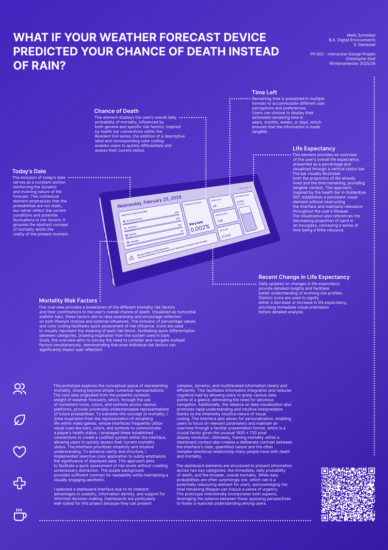
Mortality Forecast
What if your weather forecast device predicted your chance of death instead of rain?
Weather forecasts have become one of the most universally understood information formats. Everyone reads the icons, the bars, the percentages. What if that familiar grammar was turned toward something we almost never look at directly: the probability of our own death?
Mortality Forecast is a dashboard interface that displays daily mortality risk the way a weather app displays rain: clearly, quantifiably, and without flinching. The project draws on a simple but striking observation: weather forecast devices have developed a visual language so consistent and cross-platform that they communicate future probabilities to virtually anyone. Applying that same language to mortality reframes death not as an abstract distant event but as a present, measurable reality.
The interface is inspired by health bar conventions from video games, where bars, colors, and icons are used to communicate a player’s status at a glance. These established visual conventions allow users to quickly assess their mortality risk without needing to interpret complex data. Selective color application with a purple background providing high contrast emphasizes significance without creating unnecessary distraction.
The dashboard presents two complementary perspectives: the immediate daily probability of death (often surprisingly low, and potentially reassuring) and the broader view of remaining lifespan (which can induce a sense of urgency). The prototype deliberately holds both in tension, using the contrast between them to foster a nuanced relationship with mortality rather than fear or denial.
Key elements include a Chance of Death indicator, a Life Expectancy status bar (inspired by GoldenEye 007’s health visualization), Time Left displayed in years, months, and days, Mortality Risk Factors broken down by category, and a Recent Change in Life Expectancy feed for daily updates. The unusual 1920 x 720 pixel format, wide and cinematic, frames mortality as a dashboard rather than a warning.